
Good Book Design That Makes Readers Choose Your Book

Source: Adobe Stock
A reader often sees your book in a split second: a thumbnail on a phone, a retail page grid, a shelf glance. That moment carries cognitive weight because people form quick impressions from visual cues and use them to decide what deserves attention. Research on processing fluency helps explain why: when something feels easy to process, it tends to feel better, more “right”, and more appealing (Reber, Schwarz and Winkielman, 2004).
Good book design starts there. A cover communicates genre, tone, and quality signals before the blurb gets a chance. Book designing becomes easier when the target is clear: attract the right reader, set expectations that match the reading experience, and present the title with immediate clarity. In online book selection contexts, readers do use cover cues when they choose what to click and what to skip (Gudinavičius and Šuminas, 2018).
The Cover As “Paratext” That Frames The Reading Experience
Publishing studies describe the cover as part of a book’s paratext: the threshold around the text that shapes interpretation and reception (Genette, 1997). That framing matters in two practical ways for authors and for designers who care about results.
The Cover Sets The Reading Contract
A reader uses the cover to infer pace, tone, and stakes. When the contract feels coherent, the decision process tends to feel smoother. Processing fluency research suggests that organisation, clarity, and an intelligible hierarchy can support positive evaluation (Reber, Schwarz and Winkielman, 2004). The aim is not minimalism as a style choice. The aim is a design structure that lets the eye resolve “what is this?” quickly, then rewards attention with nuance.
The Cover Functions As A Market Signal
Covers also signal positioning. Signalling theory explains how visible features can convey otherwise hidden attributes, such as quality, competence, or fit (Spence, 1973). In book cover work, that signal often comes from disciplined typography, controlled colour, a stable layout grid, and genre-credible imagery. These cues help a reader predict what kind of experience sits inside, even when the author has low recognition.
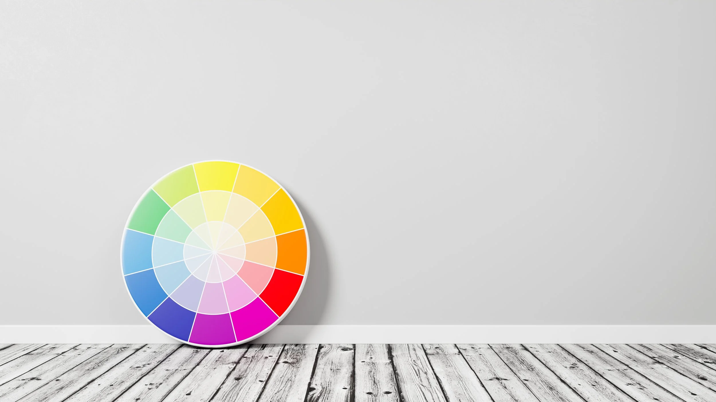
Colour: Evidence-Led Mood, Not Guesswork
Colour choices influence affect, cognition, and behaviour, and colour meanings can operate quickly and implicitly (Elliot and Maier, 2014). Colour preference also links to learned associations with objects and environments, which shapes what feels “pleasant” or “right” to people (Palmer and Schloss, 2010). In practice, palette decisions deserve the same seriousness as title selection.
Colour Emotion Can Be Modelled
Colour emotion research has mapped how observers rate colours on dimensions such as warm–cool, active–passive, and tense–relaxed (Ou et al., 2004). Those dimensions translate cleanly into cover work because they mirror what readers often look for in genre signals: tension, intimacy, wonder, restraint, urgency, calm. The palette still depends on your story world and your subgenre, yet the principle stays consistent: colour creates an emotional forecast that primes interpretation (Ou et al., 2004; Elliot and Maier, 2014).
A Practical Palette Method For Good Book Design
A strong palette starts with the story promise, then checks against genre recognition. Palette work tends to go off-track when it starts from personal taste alone. A useful method is to define your emotional promise in one sentence, then translate that promise into colour attributes (temperature, saturation, contrast), then test the cover at thumbnail size. This turns “book design ideas” into decisions you can defend and repeat across a series.
Source: Adobe Stock
Typography: Typeface Persona, Hierarchy, And Perceived Meaning
Readers assign personality traits to type. Typography contributes meaning beyond literal words because typefaces carry perceived qualities and social signals (Brumberger, 2003). That finding matters for covers and for book page design: type becomes part of the book’s identity system.
Typeface Meaning Shows Up In Reader Judgement
Research on typographic allusion shows that readers can agree on perceived characteristics of typefaces and that typographic features can shape interpretation (Lewis and Walker, 1989). That supports a simple professional rule: type choice should align with genre expectations and emotional tone with intention. A mismatch can trigger doubt or confusion at the exact moment the cover needs confidence.
Legibility Is Part Of Credibility
For covers, legibility must hold at thumbnail size. For interiors, legibility shapes reading comfort and trust. Classic work on print legibility shows that typographic variables influence reading efficiency and ease (Tinker, 1963). Book layout design decisions are not cosmetic. They influence the reader’s physical experience of the text, which influences how “professional” the book feels over time.
A useful standard here comes from typographic practice: create a hierarchy system (title, author, series, tagline) that behaves consistently across formats and sizes, then keep it stable. Bringhurst’s typographic guidance is widely used in professional work because it turns craft into repeatable standards (Bringhurst, 2013).
Imagery And Composition: Visual Grammar That Guides Attention
Images do more than decorate. Visual communication research explains how layout, framing, salience, and information value guide what viewers notice first and how they interpret a scene (Kress and van Leeuwen, 2006). This framework applies directly to cover layout: focal point, hierarchy, and negative space decide where the eye lands, then where it moves.
One Dominant Focal Point, One Clear Reading Path
A cover usually performs best when it gives the eye a primary anchor and a structured path: focal point first, title second, author third. The viewer should not need to “hunt” for the message. That is composition as communication, and it sits at the heart of good book design.
Art Direction Can Operate As A Quality Cue
Marketing research on “art infusion” suggests that the presence of visual art can transfer favourable quality and luxury perceptions to a product through spillover effects (Hagtvedt and Patrick, 2008). For books, illustration and art direction can therefore act as quality cues when executed with relevance and discipline. This does not mean every cover needs fine art. It means craft in imagery and composition carries commercial weight.
Genre Cues: What Readers Recognise And How They Categorise
Genre signalling is a shared language. Readers use conventions to sort books into meaningful categories, and research suggests that knowledgeable readers can identify subgenre cues through cover design features (Dixon, Bortolussi and Mullins, 2015). That finding matters because it turns “genre feel” into something testable: a cover can be evaluated for classification accuracy with the right audience sample.
Work on online selection supports the same direction: readers use cover cues during book choice, including colour and design features (Gudinavičius and Šuminas, 2018). That means your cover does market work even when the author name has low recognition.
Publishing-focused case study work also treats the cover as part of how fiction is marketed and understood, highlighting the cover’s role in shaping reader expectations and response (Matthews and Moody, 2007). For authors, this reframes the brief: the cover exists to match the right reader with the right experience, then reduce uncertainty in the buying moment.
Cover-To-Interior Coherence: Where Trust Gets Reinforced
A cover can attract attention, then the interior either sustains confidence or weakens it. Book layout design plays that role quietly, because the reader experiences it line after line.
Screen And Print Constraints Influence Reading Behaviour
Research comparing paper and screens finds reliable differences in reading experience across contexts, with implications for fatigue, behaviour, and performance (Dillon, 1992). Screen-reading research also shows that formatting variables such as line length can influence reading effectiveness (Dyson and Haselgrove, 2001). That is the practical reason book page design cannot sit as an afterthought: format decisions change how the text feels to read.
A Layout System Protects Reading Flow
Strong interior systems rely on stable principles: consistent hierarchy, comfortable measure, appropriate leading, and predictable spacing (Bringhurst, 2013; Tinker, 1963). A template approach helps here. It creates consistency across chapters, supports accessibility across formats, and saves time across revisions.
A Research-Backed Decision Table For Good Book Design
Use this tool during book designing, especially when multiple stakeholders bring opinions. The point is alignment, then decisions that survive revision cycles.
| Cover Decision | What Readers Infer (Research Lens) | Practical Design Move | What To Test Before Release |
|---|---|---|---|
| Palette And Contrast | Affective meaning and preference patterns (Elliot and Maier, 2014; Palmer and Schloss, 2010) | Choose a palette tied to story setting and emotional tone; lock contrast for title clarity | Thumbnail legibility check on phone; quick “tone match” rating from target readers |
| Typeface And Title Hierarchy | Typeface persona and perceived meaning (Brumberger, 2003; Lewis and Walker, 1989) | Select type based on genre conventions and brand voice; keep hierarchy strict | 3-second recall test: title, author, genre guess |
| Central Imagery | Salience and visual grammar (Kress and van Leeuwen, 2006) | One dominant focal point; clear reading path from image to title | “First notice” feedback: ask viewers what they saw first |
| Subgenre Signalling | Covers convey subgenre cues to knowledgeable readers (Dixon, Bortolussi and Mullins, 2015) | Map genre markers consciously (colour families, type style, image motifs) | Sorting test: ask genre readers to group your cover among comparable titles |
| Finish And Production Choices | Quality signalling via visible cues (Spence, 1973) | Align finish with positioning; keep production details consistent | Print proof under real lighting; spine readability check |
| Interior Layout System | Reading comfort and efficiency (Tinker, 1963; Dillon, 1992) | Build a template for headings, scene breaks, and running elements | Sample chapter read-through on print and eReader |
A Cover Brief Template That Keeps Everyone Aligned
Book design ideas multiply fast. Quality comes from a brief that makes trade-offs explicit and keeps feedback useful.
Reader And Retailer Context
Define the core reader with specificity: subgenre, comparable authors, typical price point, and typical retailer context. A cover aimed at online thumbnails needs strong hierarchy discipline. A cover aimed at bookshop tables can carry subtler details, yet clarity still matters.
Story Promise In One Sentence
Write one sentence that states the emotional promise of the book. That sentence becomes a design filter. Palette, typography, imagery, and composition should all support it. This also keeps revisions focused because feedback can point back to the promise rather than taste alone.
Subgenre Cues Chosen On Purpose
Pick the cues consciously. Research suggests readers can detect subgenre signals through covers (Dixon, Bortolussi and Mullins, 2015). Aim for recognition plus freshness, with decisions anchored to your promise.
Production Constraints
List practical constraints in plain language: trim size, page count, spine width, series system, imprint requirements, retailer constraints, and production budget. This section prevents late-stage redesign because it keeps decisions grounded in the physical object as well as the digital listing.
When Book Design Services Add Strategic Value
Book design services create leverage when an author needs consistency across multiple titles, when a series needs a recognisable system, or when the book competes in a dense category. A professional process also enables testing: cover sorting, thumbnail legibility checks, and tone-fit ratings with real genre readers. Research supports the premise that covers operate as choice cues in online selection contexts (Gudinavičius and Šuminas, 2018).
For designers, differentiation often comes from method. Plenty of portfolios show taste. Fewer show an evidence-led process that protects outcomes under deadlines, feedback pressure, and format constraints. A research-led approach signals competence to authors and peers, and it creates repeatable results.
A book cover is a compact communication system. It signals fit, mood, and professionalism, then hands the reader into the interior experience. When those pieces align, the cover carries its weight in the market and the reading experience carries the promise through.
Gaiaa Designs uses this evidence-led approach as a practical method: a clear brief, disciplined hierarchy, and decisions you can test with real readers.
References
Bringhurst, R. (2013) The Elements of Typographic Style. Version 4.0: 20th Anniversary Edition. Point Roberts, WA: Hartley & Marks.
Brumberger, E.R. (2003) ‘The rhetoric of typography: the persona of typeface and text’, Technical Communication, 50(2), pp. 206–223.
Dillon, A. (1992) ‘Reading from paper versus screens: a critical review of the empirical literature’, Ergonomics, 35(10), pp. 1297–1326.
Dixon, P., Bortolussi, M. and Mullins, B. (2015) ‘Judging a book by its cover’, Scientific Study of Literature, 5(1), pp. 23–48.
Dyson, M.C. and Haselgrove, M. (2001) ‘The influence of reading speed and line length on the effectiveness of reading from screen’, International Journal of Human-Computer Studies, 54(4), pp. 585–612.
Elliot, A.J. and Maier, M.A. (2014) ‘Color psychology: effects of perceiving color on psychological functioning in humans’, Annual Review of Psychology, 65, pp. 95–120.
Genette, G. (1997) Paratexts: Thresholds of Interpretation. Cambridge: Cambridge University Press.
Gudinavičius, A. and Šuminas, A. (2018) ‘Choosing a book by its cover: analysis of a reader’s choice’, Journal of Documentation, 74(2), pp. 430–446.
Hagtvedt, H. and Patrick, V.M. (2008) ‘Art infusion: the influence of visual art on the perception and evaluation of consumer products’, Journal of Marketing Research, 45(3), pp. 379–389.
Kress, G. and van Leeuwen, T. (2006) Reading Images: The Grammar of Visual Design. 2nd edn. London: Routledge.
Lewis, C. and Walker, P. (1989) ‘Typographic influences on reading’, British Journal of Psychology, 80(2), pp. 241–257.
Matthews, N. and Moody, N. (eds.) (2007) Judging a Book by Its Cover: Fans, Publishers, Designers, and the Marketing of Fiction. Aldershot: Ashgate.
Ou, L.C., Luo, M.R., Woodcock, A. and Wright, A. (2004) ‘A study of colour emotion and colour preference. Part I: Colour emotions for single colours’, Color Research & Application, 29(3), pp. 232–240.
Palmer, S.E. and Schloss, K.B. (2010) ‘An ecological valence theory of human color preference’, Proceedings of the National Academy of Sciences, 107(19), pp. 8877–8882.
Reber, R., Schwarz, N. and Winkielman, P. (2004) ‘Processing fluency and aesthetic pleasure: is beauty in the perceiver’s processing experience?’, Personality and Social Psychology Review, 8(4), pp. 364–382.
Spence, M. (1973) ‘Job market signaling’, The Quarterly Journal of Economics, 87(3), pp. 355–374.
Tinker, M.A. (1963) Legibility of Print. 3rd edn. Ames, IA: Iowa State University Press.