
Foundations of Typography

Serif and Sans Serif
Distinguishing Typeface Functions: Text Type vs. Display Type
A Glimpse into the History of Letterforms
Exploring Typeface Diversity
Unconventional Type Categories
Crafting Harmony: Guidelines for Typefaces Fusion
Understanding Cases
In the realm of graphic design, the artistry lies not only in individual elements but also in their intricate relationships.
Much like the harmonious interplay of ingredients in a recipe that transforms a meal, successful design thrives on the delicate equilibrium between its diverse components. Think about adjusting an ingredient's quantity, it's not just a solitary modification, but a cascade of proportional changes across the board. Just as flavours align in a culinary masterpiece, typographic elements dance in symphony on the canvas of design.
Typography, in its essence, operates within a realm of relationships. Every typeface, character, and line commands a unique role, harmonising in size, weight, placement, and orientation. For your message to be clearly expressed, there must be harmony between the styles, colours, and other components.
In this blog, we explore the fascinating world where every aspect of design coexists with one another in a harmonious relationship.
Serif and Sans Serif
In the world of typography, the foundations rest on two primary letterforms: Serif and Sans Serif.
Starting with Serif, these letters flaunt extenders known as "little feet."

A group of Serif typefaces exists, each distinct yet unified by this common trait. The caps and lowercase letters bear these Serifs, also known as footers. Detecting nuances is key. Observe the angles and thickness of these Serifs – details that come to life when typefaces are set for reading.
Now, let's delve into two key categories of Serif: Bracketed and Unbracketed. The former showcases curved transitions, while the latter boasts a sharp 90-degree corner angle.


Enter Slab Serifs, with uniform Serif and vertical stroke width. Shifting to Sans Serif – "Sans" meaning without in French – these letters sport a clean, footless appearance. Despite their distinctions, these well-known Sans Serif typefaces share a common trait: the absence of Serifs.
Embrace the essence of type classification, the foundation of design choices. While countless typefaces exist, the art lies in recognizing basic style differences. Become a type detective, and grasp the diverse worlds of Serif and Sans Serif, your inaugural step in this typographic exploration.

Distinguishing Typeface Functions: Text Type vs. Display Type
In typography, the distinction between Text Type and Display Type is pivotal. Text Type is crafted for extended reading in smaller sizes, think newspapers, magazines, and books. It's often referred to as Body Type or Body Copy. On the flip side, Display Type commands attention in 14-point size or larger, reserved for impactful moments.
While the typeface realm holds around 200,000 choices, most fall under Display typefaces, offering an array of letterforms.
Zooming into Text Type, it typically ranges from 8 to 10 points, sometimes 12, based on the style. Its primary goal? Effortless readability. Thus, crystal-clear letterforms are crucial.
Open spaces, tall body heights, rhythmic shapes, medium weight, these define Text Typefaces. Classics still thrive, standing the test of time.
Now, Display Type. It's a statement in itself, distinct, noticeable, and non-invisible. Whether mimicking handwriting or exploring diverse styles, Display Type demands attention.
Remember, Text Type can double as Display when enlarged, but the reverse is trickier. Think of Display Type as icing on a cake – a dash adds a powerful punch, while too much might overpower.
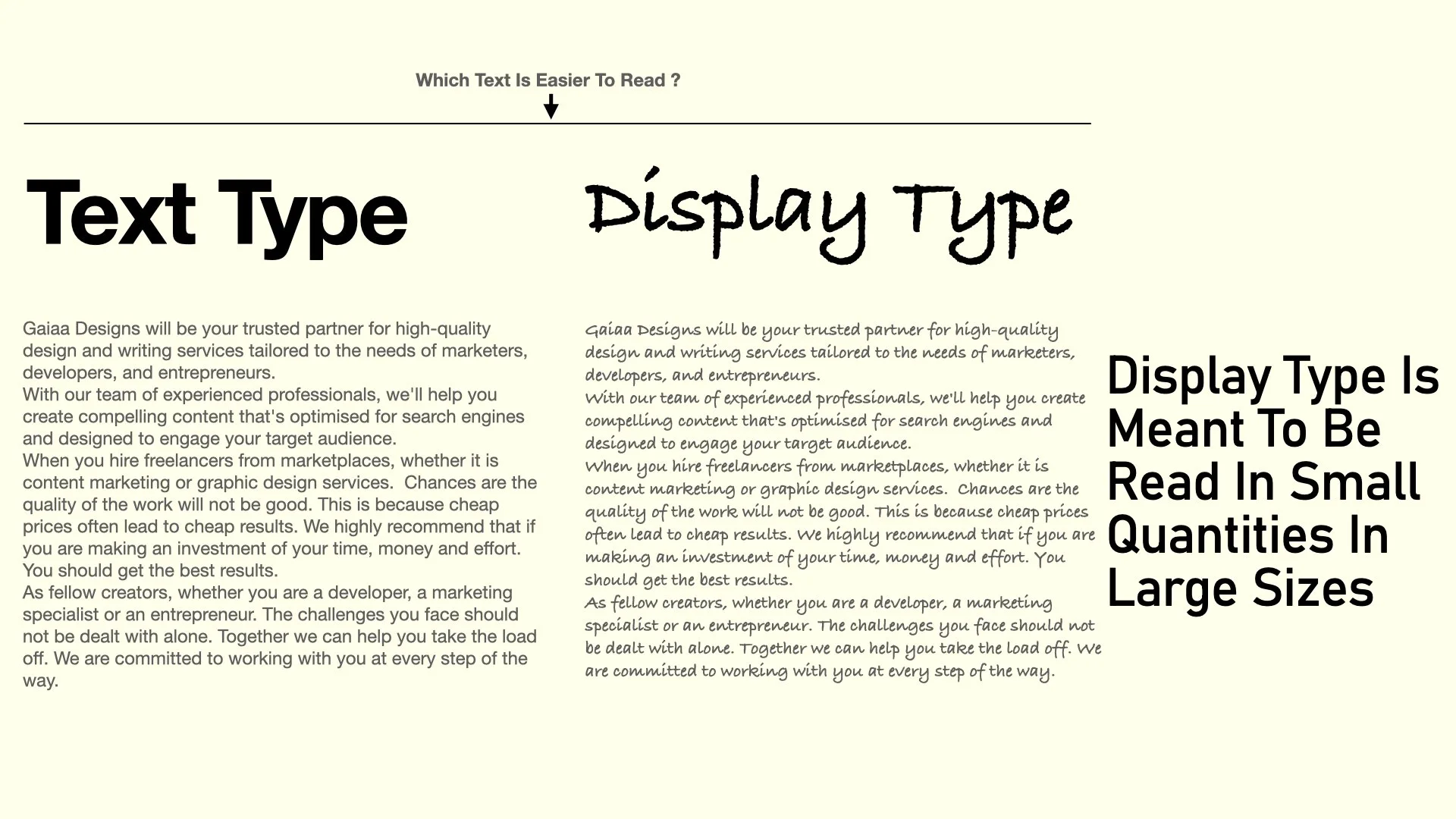
Which text is easier to read? Text type in smaller size or display type?
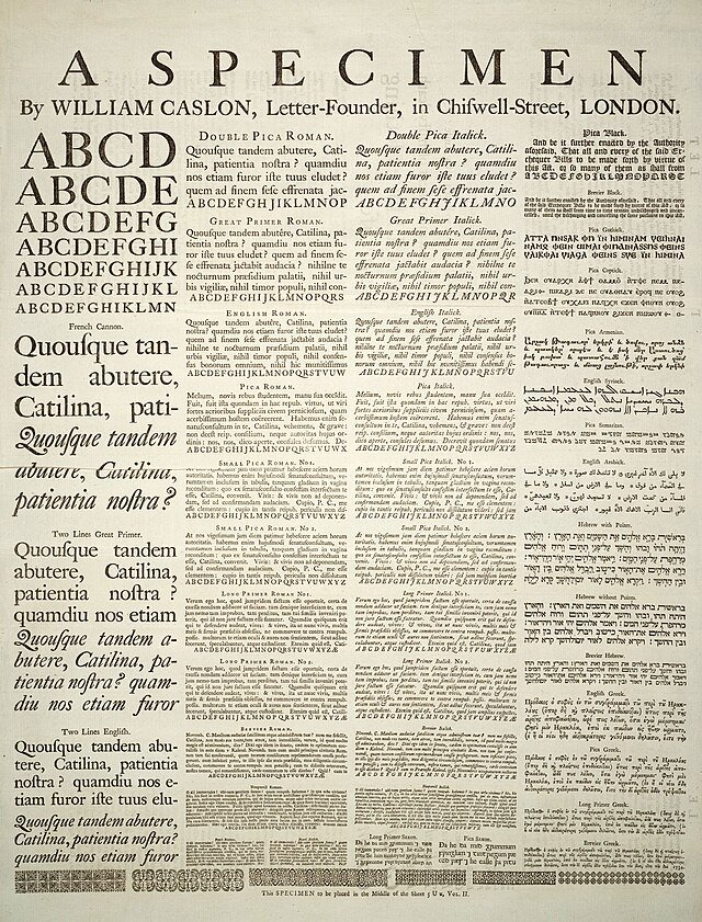
A Glimpse into the History of Letterforms
Delving into the past illuminates our understanding of Type Classification. Let's rewind to witness the roots that shaped our letterforms. Tracing back to the 5th century BCE, carved Greek letters marked an early formal use. By the 1st century BCE, Roman Monumental Capitals emerged, birthing the lineage of serif typefaces. One cherished example resides on Rome's Trajan Column, a testament to this legacy.

Rome's Trajan Column
Fast forward a millennium, pockets of diverse lettering styles flourished across Western Europe. Charlemagne's rule around 800 A.D. catalysed uniform, legible Carolingian letterforms – the basis of present-day lowercase letters.

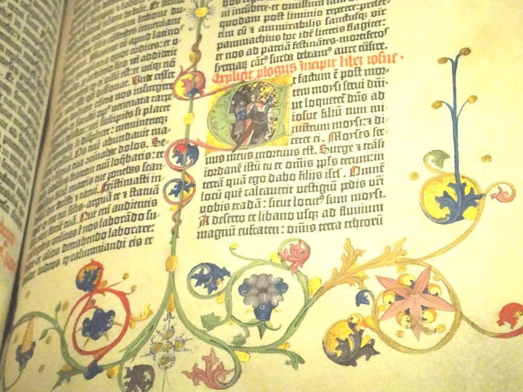
Yet, the pivotal shift came with Johannes Gutenberg's movable type innovation around 1455. His Gutenberg Bible showcased Blackletter or Fraktur type, which spread literacy across Europe, altering human history.
As movable type progressed, Roman letterforms replaced Gutenberg's style. The 15th century marked the dawn of the typographic era, laying the foundation for type classification systems. This historical voyage shapes our perception, reminding us that our present letterforms are rooted in a rich tapestry of innovation.

Exploring Typeface Diversity
Beyond the familiar realms of serif and sans serif, let's venture into the intricate world of type classification. Every typeface finds its home within a recognised tradition, crucial for making informed design choices. While no universal system reigns, allow me to introduce the fundamental categories.
First up, Oldstyle, the earliest Roman serif types, dating between the late 15th and mid 18th centuries. They flaunt low contrast between thick and thin strokes and possess distinctive bracketed serifs.
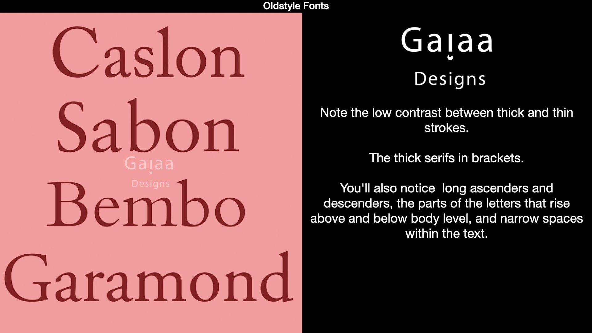
Famous Oldstyle Fonts
Transitional bridges the gap between Oldstyle and Modern, featuring sharper serifs and a more vertical stress in curved letters. The change, spurred by printing technology advancements, unfolded in the 18th century.
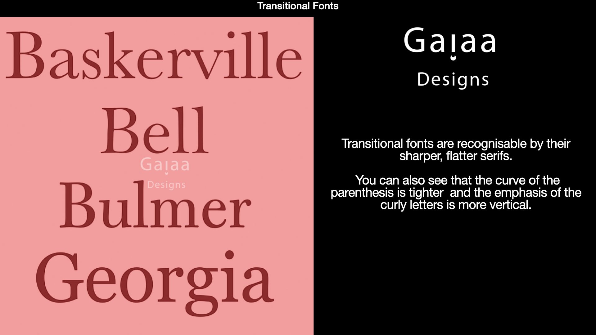
Famous Transitional Fonts
Modern, born in the late 18th century, boasts ultra-thin un-bracketed serifs and stark contrast between thick and thin strokes. Slab Serif, surfacing in the mid 18th century, dominates with its equal-weight strokes and unbracketed, square serifs, a potent choice for advertising and signage.

Famous Modern Fonts
Sans Serif's emergence in the late 1800s brought three key categories. Grotesque or Gothic typefaces offer variations in stroke width, while Humanist Sans Serif mirrors classical Roman proportions. Geometric Sans Serif, inspired by circles, squares, and triangles, encapsulates the modernist movement.
Details matter, proportions, serifs, strokes, they all weave a narrative. Remember, even newer Revival typefaces fall into this classification, showcasing evolving styles. With this knowledge, you'll charm friends during movie nights title sequences, and more importantly, make astute decisions for your design projects.
Unconventional Type Categories
Venturing beyond conventional classifications, we enter a realm of typefaces that defy neat categorisation. Meet the display typefaces, bold choices, best suited for larger sizes and sparing use. Scripts, the trendy category of handwritten-based letterforms, ranges from formal elegance to casual charm. Imagine Bickham Script with its graceful flourishes, a feast for the eyes.
Informal scripts add a personal touch, often resembling brush strokes. Zapfino, though tricky, can be a delightful choice with its swirls. Used judiciously, these flourishes can elevate layouts, as seen in a cookbook or the artistic echo of carrot stalks in a modern design.
Blackletter or Fraktur introduces a fractured, spiky aesthetic, distinctive for its stroke-built letters. Fette Fraktur stands out, exuding an almost juicy quality. Often mistaken for "Old English," these typefaces exude heaviness, with tight spacing and a bold presence on the page.

Amidst this diversity, decorative and ornamental typefaces thrive, tailored for advertising and brand identity. Display Typography thrives on fashion's whims, with bold reinterpretations, revivals, and eccentric experiments. Amidst the vast type choices, remember, a critical eye unveils possibilities, developing a discerning sense of style to suit your unique needs.
Crafting Harmony: Guidelines for Typefaces Fusion
Amidst the plethora of typographic choices, a common query arises, how to blend Typefaces seamlessly? Demystifying this process, let's unveil the art of sound type selections. The key lies in fostering harmony, avoiding a visual chaos akin to "type soup." Often, a single versatile Typeface family suffices. Take Helvetica Neue – a family with myriad weights and styles, ensuring a harmonious blend.

Projects can flourish with just one Typeface. Variations within a single family breed diversity, as evident in diverse yet consistent designs. When desiring multiple Typefaces, contrast becomes paramount. For instance, Serif for body text could pair with a Sans Serif sporting various bold weights.
Usually, two well-chosen Typefaces create a broad typographic hierarchy. Consider common traits, like Typefaces from the same historical period or by the same designer. Alternatively, blend opposites – traditional and friendly – for a balanced mix. Similar body height Typefaces harmonize if styles contrast. Avoid combining highly idiosyncratic Typefaces – like Eurostile and Cochin's mismatch.

Adding a third Typeface, say a Slab Serif to a Sans Serif text, creates differentiation. Think of outfits – one complex, one simple, for a harmonious effect. The same applies to Typefaces, intricate and uncomplicated pairings. The key? Differentiation.
Typeface blending mirrors creating an ensemble, the elements should complement. While rules aren't rigid, good taste guides. In the world of Typography, much like fashion, elements harmonise when thoughtfully paired.

Understanding Cases
Delving into cases means exploring the nuanced difference between Uppercase and Lowercase letters. Each carries a unique message, offering you a palette to convey messages effectively. Originally known as MAJUSCULES, Uppercase or Capitals exude majesty and authority. They stand strong, like building blocks, asserting importance and trustworthiness. Their visual weight commands attention, often hinting at formality and significance.
Caps thrive with a tad more breathing space around them. On the other hand, Lowercase, often referred to as minuscules, exude warmth and informality. Think of them as miniature, friendlier characters. Take the PETCO logo, its lowercase approach aligns with the warm and cuddly pet theme.

Petco Logo
Lowercase letters are designed to coexist harmoniously, unlike the bolder Capitals. A mixture of Uppercase and Lowercase sends a softer, more approachable message. Cases serve as a volume control, Uppercase amplifies, while Lowercase conveys subtlety.
Consider "dancing" in Caps, it's vibrant, like Salsa, whereas Lowercase dancing exudes a more serene Ballet vibe.
When selecting cases, think about the qualities you aim to convey. Uppercase has authority, Lowercase offers warmth. Let cases guide your visual direction, tailoring the typography to mirror your message accurately.
In the intricate world of typography, where letterforms weave stories, every detail carries weight. From Serif to Sans Serif, Display to Scripts, mastering type classification empowers us to make informed choices. Combining typefaces, be it for harmony or contrast, shapes the visual language of our designs.
Delving into cases, Uppercase exudes authority, while Lowercase brings warmth. Remember, each decision from type choice to case selection contributes to a visual narrative, allowing us to communicate with finesse and creativity. So, embrace the art of typography, where each letter speaks volumes, and let your design projects echo with the subtleties of a well-crafted typographic journey.