
Stop the Scroll: Creating Engaging Visual Hierarchy for Your Audience

Source: Adobe Stock
Confused website visitors? If your website design looks "nice" but leaves users puzzled, with low clicks and even lower conversions, chances are your visual hierarchy isn’t doing its job. Visual hierarchy shapes how people interact with a page. Readers don’t absorb every word; they glance through and pick out standout elements. If nothing grabs attention or shows what to do next, most visitors leave within seconds. Visual hierarchy guides their focus. It highlights key messages, directs the flow of attention, and points to clear actions. This article explains how it works and why it matters. You'll learn how to apply it to web design across devices, with research-backed strategies and practical examples.
Why Visual Hierarchy Matters in Website Design
First Impressions Are Instant (and Visual)
When a new visitor lands on your website, you have literally fractions of a second to impress them. Human brains form an opinion within 50 milliseconds of seeing webpage (Tuch et al., 2012). In that blink of an eye, users subconsciously decide if your site looks professional, trustworthy, and relevant or if they should hit the “back” button. Crucially, it’s not your content or logo they digest in that split-second; it’s the overall visual order and clarity of the page. Research confirms that users build a visceral first impression from a site’s visual appeal and structure almost immediately(Selejan et al., 2016). If the design appears cluttered or confusing at first glance, visitors may leave before reading a single word, never giving your actual content a chance (Selejan et al., 2016). On the other hand, a clean, well-ordered layout can instantly convey credibility. In fact, nearly 75% of users judge a website’s credibility based on its design and content presentation rather than the content itself (Selejan et al., 2016). In short, visual hierarchy has a huge impact on that vital first impression which can determine whether a user stays or bounces.
Function Over Aesthetics: Design as a “Silent Navigator”
Good visual hierarchy fundamentally consists of function. Think of it as the satnav of your website. It quietly directs visitors where to look and what to do, without them even realizing. A strong hierarchy ensures that the most important elements (e.g. your headline, value proposition, or call-to-action) grab attention first, and secondary information flows logically afterward (Interaction Design Foundation, 2016). Every design element should play a deliberate role in this guidance. For example, a bold, large title might shout the main message; a contrasting “Sign Up” button clearly indicates the next step; a testimonial slider might be visually subdued until users have absorbed the core info. By sequencing visual cues, you control the path of vision: what users notice first, next, and so on (Interaction Design Foundation, 2016). When all elements work in concert, users don’t have to think hard about how to navigate or what to focus on, the design silently does that for them. They feel in control and find what they need naturally, which boosts engagement and conversions. On a site with poor hierarchy, in contrast, everything competes for attention or appears arbitrary. It’s like a map with no markers, visitors feel lost and frustrated. No matter how “cool” or modern it looks, a design without clear hierarchy is like a guide that won’t give directions.
Visual Hierarchy and User Psychology
At its core, visual hierarchy leverages principles of human psychology and perception. Users tend to follow predictable scanning patterns and respond to certain visual cues in consistent ways. For instance, eye-tracking studies show that on desktop web pages, people often read in an “F-pattern”: they scan across the top, then down the left side of the page, occasionally reading farther along when something catches their interest (Interaction Design Foundation, 2016). On pages with less text (or on mobile devices with narrower screens), a “Z-pattern” is common: the eyes move from top-left to top-right, then diagonal to bottom-left and across to bottom-right (Interaction Design Foundation, 2016). Designers don’t force users into these patterns, our brains naturally take these paths to seek information. A smart layout works with these habits. By understanding such patterns, you can position key content at strategic spots where the gaze is likely to land (for example, placing a headline and call-to-action along the top and across the screen for a Z-pattern layout, or using clear subheadings down the left for an F-pattern page)(Interaction Design Foundation, 2016). The result is a site that feels intuitive. Users can find what they’re looking for faster, which makes them more likely to stick around, trust your brand, and ultimately convert. If time is tight or the technical details feel overwhelming, you can hire a website designer to help you implement visual hierarchy effectively.
Supporting Evidence: A famous usability adage is “users don’t read, they scan,” and research bears this out. Nielsen Norman Group’s eyetracking studies found that most people won’t read web text word-by-word, especially on initial visit (Nielsen, 2006). Instead, they hunt for standout words or sections that match their intent. If your design doesn’t provide clear focal points or logical flow, users experience cognitive overload, too much mental effort to figure out the page.Contorarily, a well-ordered design can actually reduce perceived effort. By guiding the eye logically, visual hierarchy helps users process information more easily (Interaction Design Foundation, 2016). It builds trust because visitors feel the site is transparent and user-friendly, not a puzzle to decode. In essence, visual hierarchy translates to better UX: it aligns what you (the website owner) want users to see with what they naturally gravitate toward, creating a smoother journey.
What Is Visual Hierarchy (and How Does It Work)?
Visual hierarchy in web design is the arrangement and style of your content elements in a way that signals their relative importance, so that viewers instantly know what to pay attention to first, second, third, and so on. It’s a design framework that uses size, color, placement and other visual cues to guide the viewer’s eye in a purposeful way)(Interaction Design Foundation, 2016). When done right, it makes your message clear, users see the critical stuff immediately and understand the relationships between items on the page without having to think about it. As one designer put it, “If you have a hard time figuring out where to look on a page, it’s more than likely that its layout is missing a clear visual hierarchy.”)(Interaction Design Foundation, 2016). In other words, a lack of hierarchy is practically invisible when it’s present(everything just “makes sense”), but painfully obvious when it’s absent (everything feels chaotic or equally unimportant).
Source: Adobe Stock
Key Principles of Visual Hierarchy in Design
So, how do you actually create a clear visual hierarchy? There are some fundamental design principles and techniques that form the toolkit for guiding attention. According to both design experts and research literature, the following factors are key:
Size (Scale)
Larger elements naturally draw the eye before smaller ones )(Interaction Design Foundation, 2016). Think of a news website, the headline is big and bold for a reason, to be seen first. Important content (e.g. headings, feature images) should generally be more prominent, while less critical details can be smaller. Eye-tracking studies confirm that bigger objects get noticed earlier than smaller ones (Selejan et al., 2016), and users often fixate on a large image or large text as an entry point before reading finer details.
Colour and Contrast
Bright, high-contrast colors command attention more than muted or low-contrast elements A splash of vibrant color can highlight a button or offer amid a sea of neutral tones. Using a distinct color for your call-to-action (CTA) (for example, an orange “Buy Now” button on a mostly blue/gray layout) makes it pop out as the next step. However, restraint is key, if you make everything colorful or bold, then nothing stands out. Visual hierarchy is about relative difference. Use color and contrast sparingly and purposefully to create focal points. Also ensure sufficient contrast for readability and accessibility (text should contrast with background, etc., which both aids hierarchy and is crucial for users with visual impairments )(Interaction Design Foundation, 2016).
Typography (Font Weight & Style)
Typography choices are a subset of both size and contrast. A well-chosen font and weight can create hierarchy within text content. For instance, headings might be not only larger but also in a heavier weight or a distinctive typeface to separate them from body text. A bold headline or tagline will capture attention before a paragraph of regular text. Meanwhile, using varying font sizes for heading levels (H1, H2, H3, etc.) establishes a clear content structure. Good typography practices (such as limited fonts, consistent styling, proper line spacing) also improve scan-ability, readers can quickly distinguish a quote from a caption, or a list from a normal paragraph, based on styling.
Whitespace (Spacing)
Far from being “empty,” whitespace (also called negative space) is a powerful design element. It’s the blank areas around content such as margins, padding, line spacing, it gives breathing room. Whitespace frames content and emphasizes what’s important by isolating it. For example, a lone button surrounded by plenty of whitespace immediately grabs focus, because there’s nothing else nearby to compete. Generous spacing between sections helps users understand that one section ends and another begins. In fact, including whitespace around an element effectively singles it out as a separate group of information )(Interaction Design Foundation, 2016). Crowded, crammed designs where text, images, and ads all jostle together tend to overwhelm users. Ample whitespace makes a page feel more luxurious and clear, improving comprehension and guiding the eye from one element to the next in a natural cadence.
Alignment and Layout Placement
The alignment and positioning of elements create an underlying structure that users subconsciously follow. Consistent alignment (e.g., a common left margin) creates order and lets the eye move in a straight line down content. Misaligned items or a haphazard layout feel disorganized. Also, users have learned to expect certain things in certain places, for instance, navigation menus often at the top, logos top-left, contact info or sign-in at top-right, etc. Using these conventions supports hierarchy by meeting user expectations (Soegaard, 2021). Moreover, items placed higher on a page tend to get attention earlier than those below (Selejan et al., 2016) (since people scroll down sequentially). Thus, important content should appear higher up, and less critical info can be lower. Similarly, elements that break alignment (intentionally) will stand out. For example, a centered call-out quote amid a left-aligned article draws attention due to its different alignment, it’s clearly something apart from the main text.
Proximity and Grouping
Visual hierarchy is not just there to determine what stands out first, but to show what things belong together. Proximity, how close or far elements are from each other, is a major cue for this. Related items should be grouped together, and unrelated items separated by space or dividers. For instance, a product image, its title, and price are usually grouped as one unit, distinct from other products next to them. If there’s too little separation, users might confuse where one idea/section ends and the next begins. Gestalt psychology tells us that people perceive items placed near each other as a collective, and those farther apart as unrelated (Interaction Design Foundation, 2016). So, use spacing or borders to visually chunk your content into logical sections. A clear hierarchy will emerge when each section has a defined scope and importance (with its own mini-hierarchy inside). As a bonus, this also aids scannability, users can skip to the section they care about once they identify its heading and boundary.
Repetition and Consistency
Repeating certain design elements can reinforce structure. For example, using the same style for all section headings (same font, size, color) signals to the user, “these are all headings at the same level.” Consistent button styles indicate what is clickable. This repetition creates patterns that the eye quickly recognizes, so the user spends less time deciphering and more time engaging. Consistency in design (sometimes called a design system) means once the user learns what a certain style means, they can apply that understanding everywhere, which speeds up navigation. On the other hand, breaking a pattern deliberately can draw attention. If all your body text is black and suddenly one line is red, it must be important (but use this trick sparingly!). In short, repetition creates familiarity and hierarchy by uniformity, while the strategic breaking of repetition can create emphasis (Soegaard, 2021).
These principles often work in combination. For instance, a call-to-action button might use multiple cues at once: large size, bright contrasting color, bold text, and generous whitespace around it, all to ensure it’s the most salient element on the page. Meanwhile, a secondary “Learn More” link might be smaller, in a neutral color, placed under a paragraph, and so on. The hierarchy is clear, the big button is the primary action, the small link is a footnote. If you apply these design principles thoughtfully, you effectively create a visual roadmap for your audience.

Source: Adobe Stock
How Users Scan Web Pages: Eye-Tracking Insights
We’ve hinted at how users scan content (F-patterns, Z-patterns). Let’s explore this a bit more, because understanding user reading/scanning behavior will inform how you lay out your pages for maximum engagement.
Most visitors don’t read every word on a webpage in order. Instead, they scan in ways that have been observed across many usability studies. Two of the most well-documented patterns in Western audiences are the F-shaped scan and the Z-shaped scan:
F-Pattern Scanning (Text-Heavy Pages)
On content-rich pages like articles, blog posts, or search results, users’ eyes often move in an “F” shape down the page (Soegaard, 2021). They start by reading horizontally across the top line (forming the F’s top bar). Then they move down a bit and read across a shorter line (forming the F’s second bar). Finally, they scan vertically down the left side of the content, this forms the F’s stem (Interaction Design Foundation, 2016)g.
During this vertical scan, they’re looking for keywords or visual cues (like subheadings, bullet points, links) that might match what they want; if they find one, they read that line across (Interaction Design Foundation, 2016). This creates a heatmap that often has heavy attention at the top, some in the middle left, and a trail down the left side. It’s no coincidence that many websites put key information in exactly those places. For example, navigation menus or important links are often stacked on the left or top, and headings break up text to catch the eye during that vertical scan (Interaction Design Foundation, 2016). By designing with the F-pattern in mind, you align with how users naturally browse dense information.
Z-Pattern Scanning (Simpler or Landing Pages)
When a page has a more straightforward layout with less text (like a landing page, homepage, or an online advertisement), users often take a Z-shaped path(Interaction Design Foundation, 2016). They’ll glance across the top from left to right (seeing the header, banner, or menu), then their eyes drop diagonally down and left (often this is where a big centered image or tagline might be), then across to the bottom right (perhaps where a button or contact info lies). This forms a “Z” or lightning bolt pattern. Essentially, they check the top line, then sweep through the middle, then see the bottom.
A smart design will put something attention-worthy at all the key points of that Z: top-left (usually your logo or a catchy headline, the hook), top-right (perhaps a sign-up or contact link if it’s important enough to be here, or an eye-catching graphic), middle (often the center where the diagonal falls, could be a featured image or a bold value statement), and bottom-right (commonly where a call-to-action button or link resides)(Interaction Design Foundation, 2016).
This way, as the user’s eyes trace a Z, they encounter the most important info in roughly the order you’d want them to. The Z-pattern is particularly relevant for designing above-the-fold content on a homepage or any page that should succinctly communicate a single message or invite an action without much scrolling.
It’s worth noting that these patterns are general trends, not iron-clad rules for every person or every page. Real user behavior can vary. Some users may fully read certain parts if they’re really interested, and page layout or language (like right-to-left languages) will change the pattern. Nevertheless, these models are useful starting points. They are derived from averaging many users’ eye-tracking data. Designers often use them as a framework to place critical elements. For instance, many landing page designers consciously follow a Z-pattern layout for the hero section (logo on top-left, call-to-action on bottom-right, etc.), and content writers use F-pattern knowledge to format articles (with subheads and bullet points aligned to the left margin, so scanners can catch the key terms)(Soegaard, 2021).
Eye-tracking heatmaps showing typical viewing patterns on three different websites (an “About Us” text page on the left, an e-commerce product page in the center, and a search results page on the right). The red areas indicate where users looked the most. Notice the F-shaped concentration of attention, especially on the left and top parts of each page. This visual evidence underscores how users favor headings, summaries, and prominent items while largely skimming the rest. (Nielsen, 2006)
Understanding these patterns helps you design for engagement. If you know users are likely to scan in a certain way, you can align content to that path. For example, for a blog post, you might ensure your key points or links are near the left margin (where scanning eyes travel) and that the first two paragraphs carry the most weight (since users will read more at the top) (Nielsen, 2006). If you have a promotional landing page, you’ll likely put the primary message dead center and the sign-up button where the Z ends. The goal is to naturally intersect the user’s scanning path with your most important content. This way, even a quick skim delivers the crucial information or a hook to delve deeper.
Common Visual Hierarchy Mistakes (What Not to Do)
Even experienced designers sometimes get hierarchy wrong. Here are two of the most damaging mistakes that can wreck your site’s clarity and conversion potential:
Too Many Competing Visual Priorities
One surefire way to confuse and overwhelm your audience is to make everything loud and flashy. If every other word is bold, every image is bright, and there are ten different buttons or banners blinking for attention, the user’s eye doesn’t know where to go. It’s the equivalent of a conversation where everyone is shouting, you can’t discern the message at all. Remember that hierarchy is relative: you need contrast between elements so that the most important ones stand out and the less important ones recede. A page with 20 equally bold “highlights” has zero highlights in practice. Users faced with this kind of visual noise often feel overwhelmed and will likely miss the critical info (or just abandon the page). Research in user experience indicates that visual clutter increases cognitive load and frustration (Bowers, 2023). A cluttered interface forces the brain to work overtime to filter out the irrelevant from the relevant, which is the opposite of what good design should do.
To avoid this, decide on one primary focal point per screen (or section), the single most important thing you want users to see and design everything else to support or lead toward that. For example, if the goal is to get the user to click "Buy Now", then perhaps the product name, image, price, and "Buy Now" button form the core hierarchy, and other details like reviews or specs are deliberately less visually pronounced. Use restraint with colors and contrast: maybe your brand palette has 5 colors, but reserve the brightest accent color only for CTAs or key icons, while using the more neutral tones for backgrounds and text. Limit the number of fonts and avoid too many decorative elements that don’t serve a purpose. In short, prioritize, let some things be quiet so that the important things can be heard.
Tip: If you suspect your page has too many focal points, try the “squint test.” Step back and squint at your webpage (or look at a small thumbnail of it). When blurred, what stands out first? If you can’t answer that, or you see a dozen competing blobs, it’s time to simplify and reduce visual emphasis on less critical items.
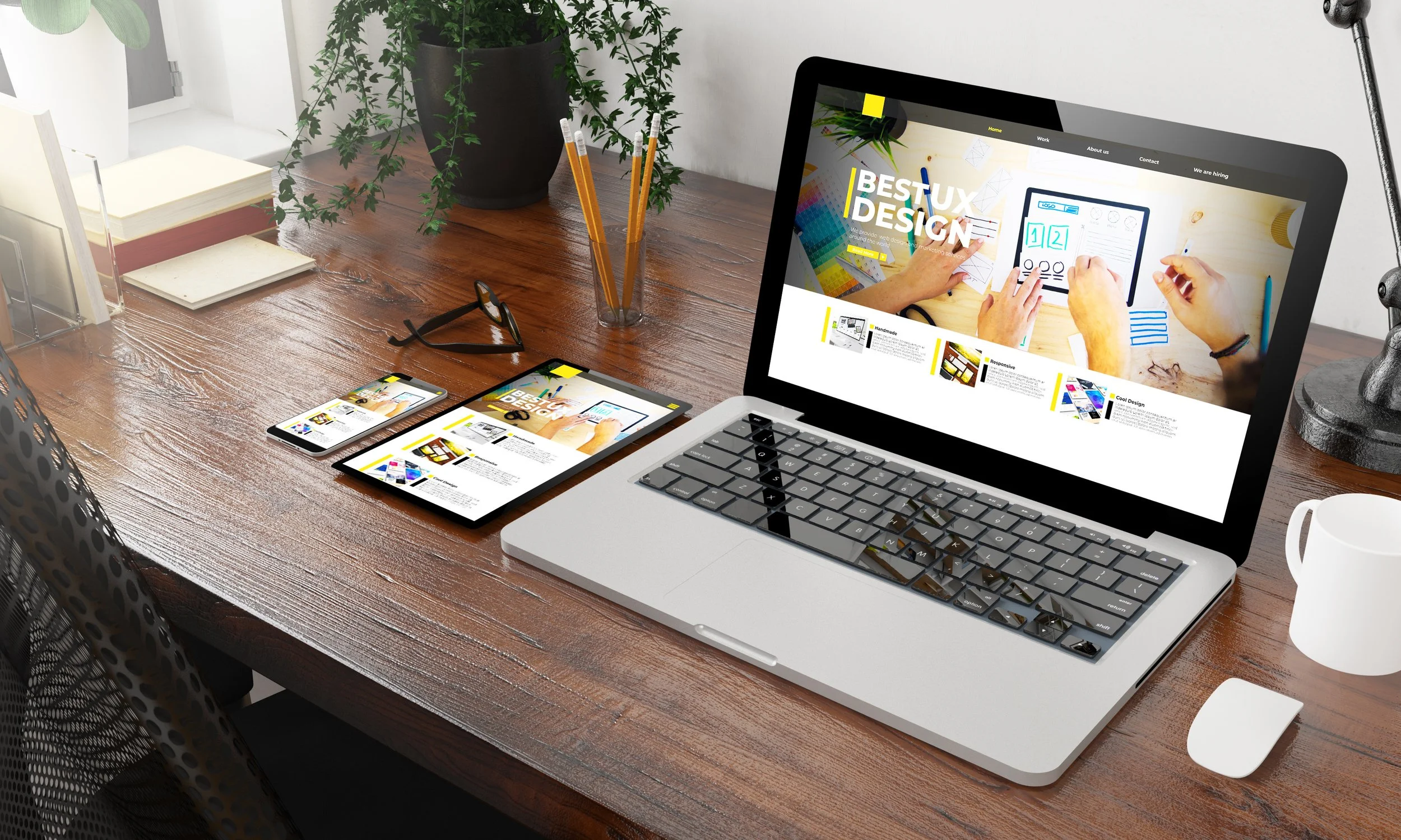
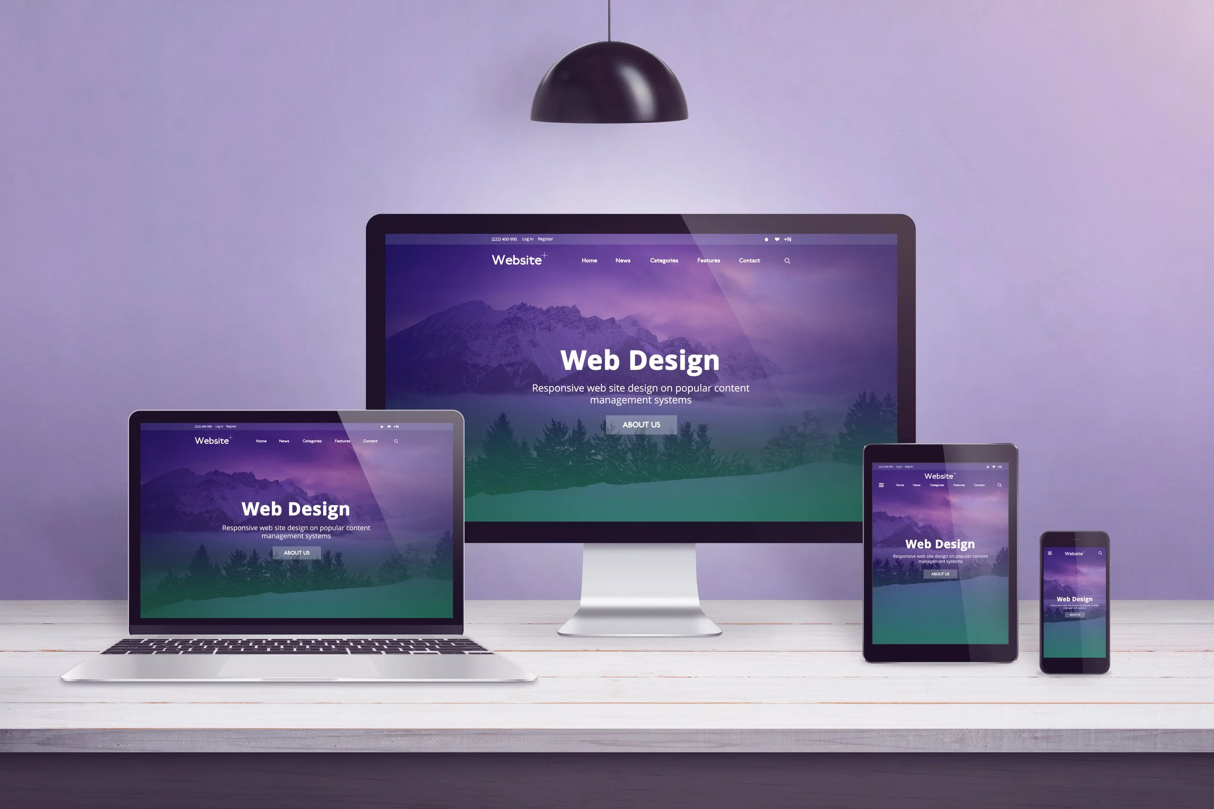
Ignoring Mobile Hierarchy (Unresponsive Design)
In today’s mobile-first world, a lack of visual hierarchy on smaller screens is a fatal mistake. As of 2025, about 64% of all web traffic comes from mobile devices (Duarte, 2025), meaning the majority of your audience is likely viewing your site on a phone. Designing for a big desktop screen alone isn’t enough. Often, a layout that looks orderly on desktop can collapse into a confusing sequence on mobile if not handled carefully. Elements that were side-by-side may stack in an odd order, text that was nicely spaced might turn into an endless scroll, and an oversized image might push the important text way below the fold on a phone screen.
Users on mobile typically scroll vertically and see less content at once, so your hierarchy needs to adapt: critical info and CTAs should appear sooner and remain clearly distinguished, even in a single-column mobile layout. A common pitfall is having a beautiful desktop homepage where the headline, image, and sign-up form are arranged in a grid but on mobile, perhaps the image takes up the entire screen first, and the headline and CTA only appear below it. The impatient mobile user might not realize there’s a call-to-action waiting below, and bounce.
To prevent such issues, always use responsive design techniques and test the hierarchy on various screen sizes. Often this means re-thinking the order of content blocks for mobile, using accordion menus or other patterns to keep it digestible, and ensuring that tap targets (buttons) are prominent and easy to click. Also, pay attention to font sizes and spacing on mobile; something that was a subtle subheading on desktop might appear too small or get lost on a phone. Many businesses have learned the hard way that a site which isn’t hierarchy-optimized for mobile ends up driving away potential customers, no matter how great it looks on a large monitor.
In summary, mobile hierarchy is a baseline requirement. If your mobile visitors have to zoom, squint, or hunt for the info that should be obvious, that’s a hierarchy failure. The good news is that by applying the same principles (size, contrast, spacing, etc.) with a mobile lens, you can create a seamless, user-friendly experience.
A well-structured mobile page might use larger buttons, shorter headlines, and more spacing to ensure clarity on a small display. Make sure to prioritize elements so that what’s most important appears first on mobile, you might not have room for a grandiose banner, so lead with what matters (for example, the value proposition text could come above a decorative image on the phone version). The bottom line is that you don’t let your mobile users get a second-rate design. A hierarchy that shines on every device will maximize your engagement and conversion opportunities. If this feels like a lot to juggle on your own, you can always bring in a graphic designer who can structure your pages with clarity from the start.
Source: Adobe Stock
Best Practices for an Engaging Visual Hierarchy
Having covered the principles and pitfalls, let’s look at some actionable best practices to build a visual hierarchy that effectively guides your audience and boosts engagement. Think of these as guidelines to “design with intent”, every choice should have a reason rooted in clarity and user experience.
Craft a Logical Content Flow
Before even diving into visual styling, make sure the information architecture and content sequence make sense. Ask: What is the primary action or message on this page? What should the user see first, second, third? Sketch a rough outline of the content in the ideal reading/viewing order. For example, a classic landing page flow might be: 1) Attention-grabbing headline, 2) a supporting subheadline or brief intro text, 3) a strong call-to-action button, 4) supporting info like features or testimonials, and so on. Once you have this flow, design to reinforce it visually. In practice, this could mean placing the headline at the top in a large font, followed immediately by a slightly smaller subheadline, then a contrasting button. Additional sections (features, testimonials) would come below in a clear hierarchy.
The user’s eye should naturally follow this intended path without feeling lost or distracted. A good rule of thumb is that a visitor skimming from the top of the page downward should incrementally receive the full story: each subsequent heading or image should logically continue the narrative or decision process. If random unrelated elements interrupt (like a newsletter signup popping up too early, or a big unrelated graphic in the middle of a list), reconsider their placement or visual priority. The mantra “don’t make me think” (coined by usability expert Steve Krug) applies here: a smooth visual flow means the user isn’t consciously figuring out the interface, they’re simply absorbing your content in the right order.
Use Visual Emphasis Strategically (Especially for CTAs)
Not everything can be top priority and that’s okay. Decide on your primary goal for the page and make sure one element unequivocally represents that goal (often this is a CTA like “Contact Us”, “Get a Quote”, “Sign Up”, etc.). Then, make that element visually distinctive. Common tactics include using an accent color that isn’t used anywhere else on the page (Soegaard, 2021), making the button larger than other buttons or links, or adding an icon/arrow that draws the eye. Surround it with whitespace to give it even more focus. Importantly, keep the wording clear, a visually prominent button labeled in vague terms (“Learn more”) is weaker than a moderately styled button that says exactly what will happen (“Download the free guide”). So hierarchy is about content clarity too. For secondary actions (say, “Watch Demo” vs. the primary “Start Free Trial”), design them to be noticeable but less dominant – perhaps a hollow outline button instead of a solid color, or a smaller size. This way, users can still find them, but they won’t pull attention away from the main thing.
Remember, visual hierarchy leads to action hierarchy. Users tend to act on whatever draws them the most. One case study in e-commerce design, for example, found that emphasizing the product benefits and a prominent “Add to Cart”button (through color contrast and placement) significantly increased conversions, whereas a previous design buried the add-to-cart in a sea of links and saw poorer results. The takeaway is to use your “design spotlight” wisely, shine it on what drives your business or user goals.
Align with Natural Eye Movement and Reading Habits
Leverage the F and Z patterns by aligning content accordingly. For text-heavy pages (blogs, articles, FAQs), structure your content with clear headings, subheadings, and bullet lists that align to the left margin, since readers will scan down that left edge (Interaction Design Foundation, 2016). For instance, start paragraphs or bullet points with keywords when possible, because as users scan vertically, they tend to read the first few words of each line (this is sometimes called having strong “entry points” for scanners)(Nielsen, 2006). Also, front-load important information in the first two paragraphs, users give the most attention to the top of the page, and might only read those thoroughly before scanning or deciding to stay (Nielsen, 2006).
On more visual pages or interfaces (like a homepage or product feature page), design in blocks that correspond to a Z-pattern: e.g., a horizontal band at top (with a logo and tagline on left, maybe a sign-up link on right), a diagonal emphasis (perhaps an image or diagonal guiding graphic), and a strong call-to-action at bottom-right. Make sure to include something attention-worthy at all the major “stops” of the Z path (Interaction Design Foundation, 2016). Even using subtle directional cues can help, like an arrow in an image that points toward your sign-up form, or a person in a hero image looking toward the CTA (people instinctively follow gaze direction).
Another useful tactic is to consider visual rhythm which is the idea of alternating intensity to guide the viewer. For example, a bold section (dark background with white text) could be followed by a light, minimal section (white background, simple text) to give a sense of progression and not overwhelm in one go. This contrast in section styles itself creates hierarchy across your page, signaling new sections or topics. It also keeps the eye engaged as the user scrolls, almost like chapters in a book.
Test Your Design with Real Users or Tools
After implementing visual hierarchy best practices, it’s important to validate that they work as intended. Sometimes, designers assume a certain element is obvious, but users might still miss it. Usability testing can catch these issues. You don’t need a full eye-tracking lab for basic testing, even informal observation of a few users can reveal if they’re noticing and understanding the right things in order. Ask someone to glance at your page for 5 seconds and tell you what they think the page is about, if they mention the key headline or offer, great. If not, you may need to crank up the emphasis on those elements. Similarly, tools like heatmap analytics (e.g., Hotjar or Crazy Egg) can show you where users click or how far they scroll, which can indirectly tell you what’s grabbing attention. If an important button is rarely clicked, perhaps it’s not visually prominent enough or looks secondary.
Interestingly, modern technology even offers AI-based predictive tools for design. These tools use algorithms to predict where a user’s attention will go when looking at your design, often by analyzing visual features. Essentially, they simulate eye-tracking without actual users (Acclaim Agency, 2025). For example, an AI-driven prediction might highlight that your banner image is so vivid that it’s overshadowing your headline, prompting you to adjust. While such predictive tools (and AI design assistants) are still evolving, they can provide quick feedback in the design phase. They’re like getting a second pair of (machine) eyes on your layout. Just remember they are supplements, not substitutes, for real user feedback.
And don’t forget A/B testing when appropriate. If you’re torn between two versions of a page, say, one where the call-to-action is red and one where it’s green, let the users decide by measuring engagement or conversion on both versions. A/B tests have repeatedly shown that even small changes in visual hierarchy (like wording or color of a button, or moving a key piece of info higher on the page) can impact user behaviour and business metrics. Data-driven refinement will ensure your visual hierarchy isn’t just theoretically good, but truly optimized for your audience.
Keep Brand Consistency, But Prioritise Clarity
One concern businesses sometimes have is: “We have a unique brand style, will using common hierarchy practices make us look generic?” The truth is, you don’t have to sacrifice brand identity for usability. Visual hierarchy principles are quite flexible, they don’t dictate what your design looks like in terms of style, only how to structure that design for clarity. You can (and should) use your brand’s colors, fonts, and aesthetic, just deploy them in a hierarchical way. In fact, a good hierarchy can enhance your brand voice by ensuring that users notice and absorb the elements that carry your brand message the most. For example, if your brand tone is friendly and you have a fun mascot illustration you use, by all means include it, just make sure it’s placed appropriately (perhaps as a supporting visual near a call-to-action or headline where it can reinforce the message, rather than, say, as a giant background that distracts from the product features). Consistency is key so use your brand styles consistently for similar types of content. All section titles might use the same signature color or font, for instance. This creates a cohesive look (supporting brand feel) while also forming a consistent hierarchy level as discussed.
Where brand and hierarchy can conflict is if a brand style guide was created without web usability in mind. For instance, maybe your print branding uses very light gray text on a white background for a subtle look, that’s hard to read on screen and destroys hierarchy (because nothing stands out if everything is low-contrast). In such cases, you might need to adapt the style for the web: perhaps using that gray for large display text only, or using it sparingly. The user experience should come first, but there is almost always a way to honor the spirit of a brand while improving clarity. If in doubt, lean towards what’s easiest for the user’s eyes and mind, remember that a frustrated user won’t stick around long enough to appreciate brand nuances anyway. Many successful websites achieve a distinct look & feel while still following core hierarchy rules (just look at Apple’s site: it’s very on-brand, yet uses classic techniques like big product images with clear messaging, ample whitespace, and obvious calls-to-action – nothing confusing about it).
Source: Adobe Stock
At the end of the day, visual hierarchy consists of communication. It entails speaking to your website visitors through layout and style, telling them “Here’s what to look at first, here’s what to do next.” A well-crafted hierarchy takes into account human psychology (how we perceive and process visuals) and marries it with your business goals (what you want users to see and do). The reward is a website that not only looks good but actually performs, users stay longer, understand your offerings better, and convert more readily when they aren’t struggling to find information or drowned in a sea of equal-emphasis content.
In practical terms, building a strong visual hierarchy means doing your research and iteration: know your audience and what they care about most, highlight that, reduce distractions, and test different approaches. We now also live in an era where tools (analytics, heatmaps, even AI predictors) can guide your design decisions with data, making it easier to refine the hierarchy continually.
If you feel unsure about how to implement these principles, consider consulting with experienced website designers who specialise in user-centric design. (When evaluating designers, look at their portfolio for clarity and coherence in designs, not just visual flair. The best web design is the one where form follows function, and each design choice has a purpose.)
To tie it all together: stop the scroll by giving users a reason to stop, a striking headline, a beautiful image with a clear message, an irresistible offer button, and then lead them on a journey. With effective visual hierarchy, you’re telling a story in split-seconds, and guiding your audience step-by-step toward engagement. In a crowded online world, that guidance is a welcome breath of fresh air. Once these evidence based design principles are applied, your website can move from “looks okay, but doesn’t do much” to engaging, intuitive, and conversion-friendly, which ultimately means a better experience for your visitors and better results for your business.
Bibliography
Acclaim Agency. (2025) [The Science of Eye Tracking: Where Users Really Look on Your Website]. Available at: https://acclaim.agency (Accessed: 15 November 2025).
Bowers, M. (2023) Reducing Cognitive Overload: Declutter Your Design for Better UX. Lion & Mason. Available at: https://lionandmason.com (Accessed: 15 November 2025).
Duarte, F. (2025) Internet Traffic from Mobile Devices. Exploding Topics. Last updated: 10 July 2025. Available at: https://explodingtopics.com (Accessed: 15 November 2025).
Interaction Design Foundation. (2016) What is Visual Hierarchy? Interaction Design Foundation – IxDF. Available at: https://www.interaction-design.org/literature/topics/visual-hierarchy (Accessed: 15 November 2025).
Nielsen, J. (2006) F-Shaped Pattern For Reading Web Content. Nielsen Norman Group. Available at: https://www.nngroup.com/articles/f-shaped-pattern-reading-web-content-discovered/ (Accessed: 15 November 2025).
Tuch, A.N., Presslaber, E.E., Stöcklin, M., Opwis, K. and Bargas-Avila, J.A. (2012) ‘The role of visual complexity and prototypicality regarding first impression of websites’, International Journal of Human-Computer Studies, 70(11), pp. 794–811. Available at: https://static.googleusercontent.com/media/research.google.com/en//pubs/archive/38315.pdf(Accessed: 15 November 2025).
Selejan, O., Muresanu, D.F., Popa, L., Muresanu-Oloeriu, I., Iudean, D., Buzoianu, A. and Suciu, S. (2016) ‘Credibility judgments in web page design – a brief review’, Journal of Medicine and Life, 9(2), pp. 115–119. Available at: https://pmc.ncbi.nlm.nih.gov/articles/PMC4863498/ (Accessed: 15 November 2025).
Soegaard, M. (2021) What is Proximity? Interaction Design Foundation – IxDF. Available at: https://www.interaction-design.org/literature/article/visual-hierarchy-organizing-content-to-follow-natural-eye-movement-patterns?srsltid=AfmBOoq00by_8DO7ItW53HHoQxzPzBGzBNsLSKwPhc-DFhvwdVNqFANu#:~:text=,eyes%20to%20the%20brighter%20one (Accessed: 15 November 2025).